
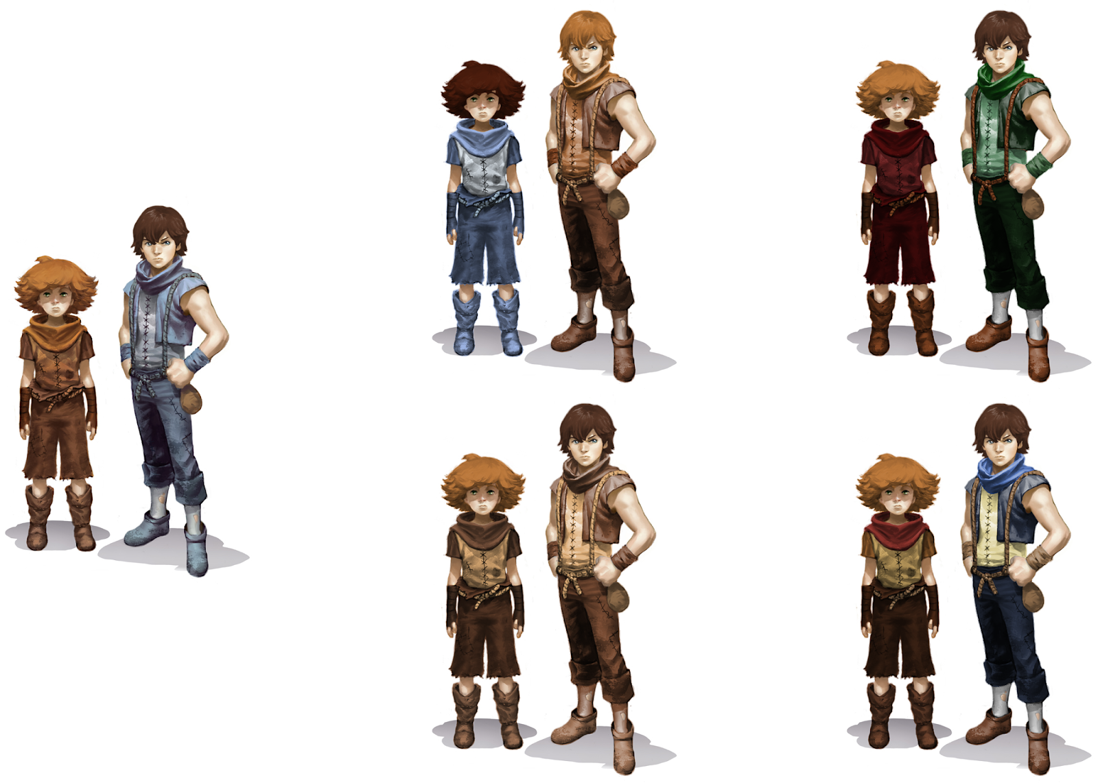
Colour is used in Brothers: A Tale of Two Sons to contrast the characters from the environment and each other. I experimented with changing the complementary colours, and also desaturating them for a more natural feel. The last design is my preference in that the designs aren't over saturated like the original, but still have highlights of identifying colour. The younger brother's personality is shown through the warmer, more active oranges and browns, while the older brother, who is calmer and more responsible, is mostly blues.
In Prince of Persia, there was a drastic change from the earlier designs of both characters, especially in the colours. The original iteration of Elika had much of her ratio being taken up by the bold red, which was a bit aggressive for her personality and the rest of the environment. The Prince's blue scarf suggested he was the calmer of the two in comparison, and the change to the current colours suits both much better. The glowing white of Elika's shirt give her a more mystical atmosphere, and the Prince is clearer on screen with the red and blue scarf instead, and the wider spectrum of other colours doesn't make him as bland as he did in the earlier design.

No comments:
Post a Comment